5 Best Product & UX Design Portfolios to Inspire You in 2025
Discover 5 outstanding UX and product design portfolios from top designers in 2025. Get inspired by layout ideas, case studies, and portfolio trends.
As we step into 2026, the barrier to entry for digital design has shifted. With AI now capable of generating clean layouts and standard UI components in seconds, the "good enough" portfolio has become a commodity. Having a solid baseline of shipped projects and deep case studies is no longer the finish line—it’s the prerequisite.
In this landscape, the designers who stand out are those who treat their portfolio as a product in itself. We aren’t just looking for people who can use a grid; we are looking for those who know when to break it. The five portfolios featured below all share a foundation of rigorous, real-world case studies, but they’ve climbed a step higher. They’ve moved past the "everyday template" to create something intentional, tactile, and delightfully crafted.
Timothy’s portfolio is a masterclass in breaking the "SaaS-bore" aesthetic. While many product designers play it safe with rigid, predictable layouts, Tim opts for an asymmetrical, artistic approach that feels more like a curated scrapbook than a digital CV.
Why it stands out: The site acts as a living resume of his Webflow and motion skills. From the "Loading" percentage indicator that builds anticipation to the silky-smooth transitions, every interaction feels bespoke. It proves that you can be a high-level Product Designer while still maintaining a raw, creative edge.
The Lesson: Don't be afraid of personality. A portfolio can be "professional" and "artistic" at the same time.
Luis Bizarro occupies the space where code becomes art. As a creative technologist, Luis rejects the modern "framework" culture. While the rest of the web is built on React or Vue, Luis’s site is a masterclass in vanilla JavaScript and high-performance creative coding.
Why it stands out: This isn't just a site; it’s an immersive installation. By bridging the gap between developer and artist, Luis uses WebGL and custom shaders to create a fluid, liquid-like experience. It’s a reminder that true technical depth can be the ultimate differentiator in a sea of drag-and-drop sites.
The Lesson: Technical mastery is a design tool. When you understand the "how," you can push the "what" further than anyone else.
Wildy Riftian’s portfolio brings a much-needed sense of "play" to the web. Built on Framer, his site utilizes a physical-to-digital interface anchored by a striking yellow-and-black brand identity. It feels tactile, responsive, and incredibly alive.
Why it stands out: The interactive "keychains" and charms that dangle and react to your cursor movement are unforgettable. Combined with a folder-based navigation system, the site feels like a physical object you are interacting with rather than a flat screen. It’s high-end motion design disguised as digital toys.
The Lesson: Interactive "delight" creates memory. If a user has fun on your site, they won't forget your work.
Divyansh Pareek brings a unique perspective to the craft, pivoting from Data Science to Product Design. This "first-principles" thinking is evident in his work, but his portfolio avoids the clinical feeling you might expect from a data background. Instead, it balances professional clarity with a deeply personal, philosophical narrative.
Why it stands out: The "mouse takeover" and playful aesthetic add a layer of whimsy to a very serious set of credentials. Divyansh nails the balance between showing he can handle complex financial systems (like Amazon Pay) and showing he hasn't lost his creative soul.
The Lesson: Your background is your superpower. Use your portfolio to tell the story of how you think, not just what you made.
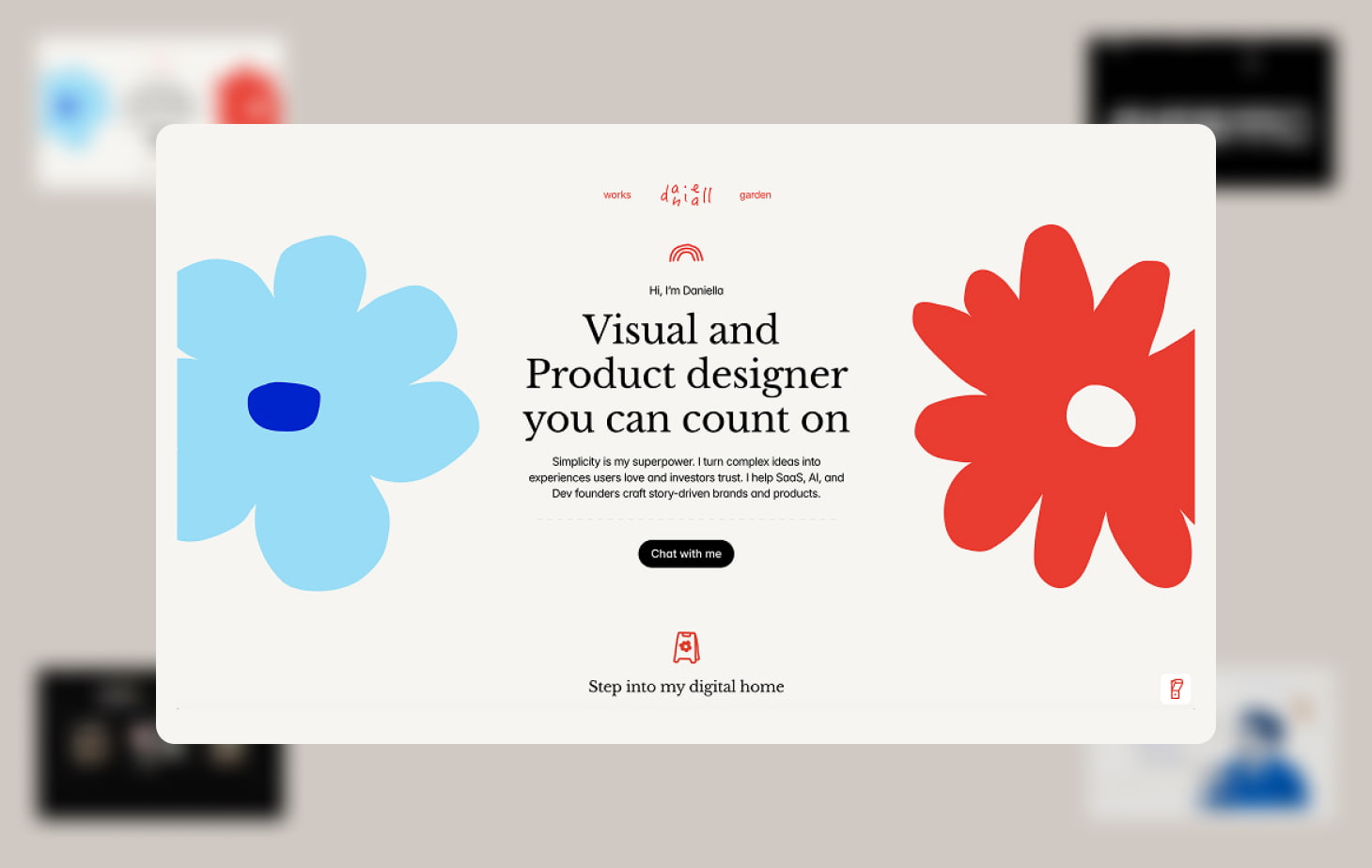
Daniella Marynov proves that B2B and SaaS design don't have to be cold or industrial. Her "story-first" approach focuses on humanizing the most technical sectors—AI, DevTools, and MedTech—through a warm, illustrative lens.
Why it stands out: The color palette is the star here. By using soft greens, muted reds, and creams, Daniella creates an approachable environment that feels "human." In a world of "scary" AI and complex data, her design language builds immediate trust and accessibility.
The Lesson: Visual tone is a strategic choice. Use color and illustration to make complex problems feel solvable.
Great design portfolios in 2026 combine visual polish with deep, intentional storytelling. These five designers have moved beyond the baseline, using their sites to prove they are thinkers, artists, and engineers all at once.
Use this list not just for inspiration, but as a checklist for your own site: Is it intentional? Does it have personality? Does it work as well as it looks?
Discover 5 outstanding UX and product design portfolios from top designers in 2025. Get inspired by layout ideas, case studies, and portfolio trends.

Learn how to create a UX portfolio that gets noticed. Step-by-step tips, layout advice, and real-world examples from top designers in 2025.